5 UX Lessons From Linear's Project Overview UI - Linear UI Breakdown
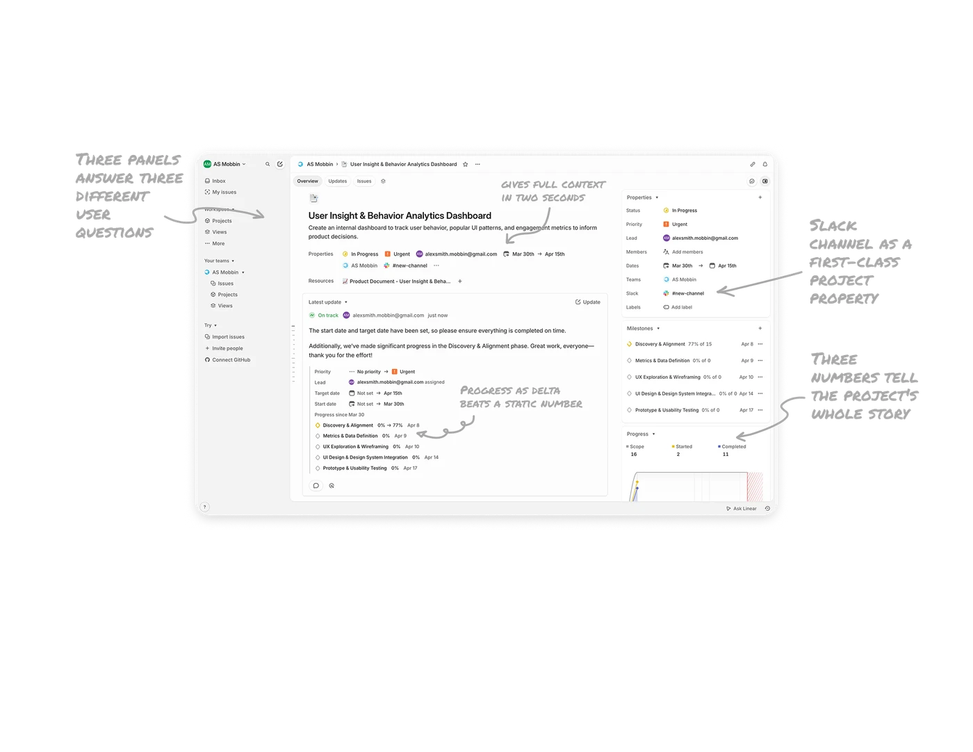
Three panels answer three different user questions
Left panel asks "where am I," center panel asks "what does it say," right panel asks "what about it." Each column carries a distinct job. In complex work tools, three-column layouts reduce context switching better than any other pattern because users always know which panel to look at for which type of information.
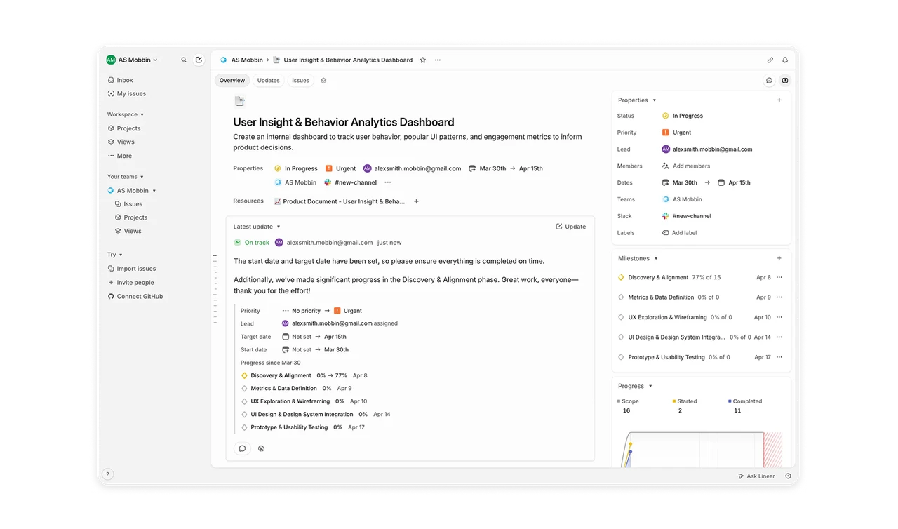
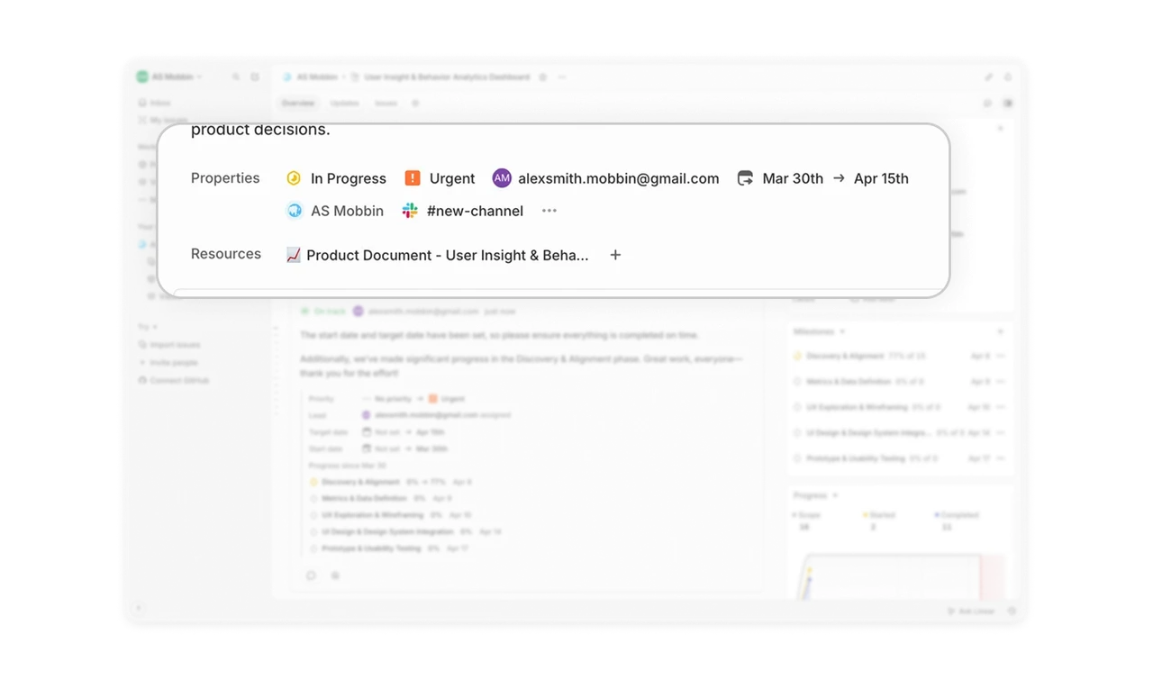
Inline metadata row gives full context in two seconds
Status, Priority, Lead, Team, and Channel sit as a single scannable row directly under the title. The same fields also live in the right sidebar. This redundancy is intentional, it serves skimmers and detail readers at once.
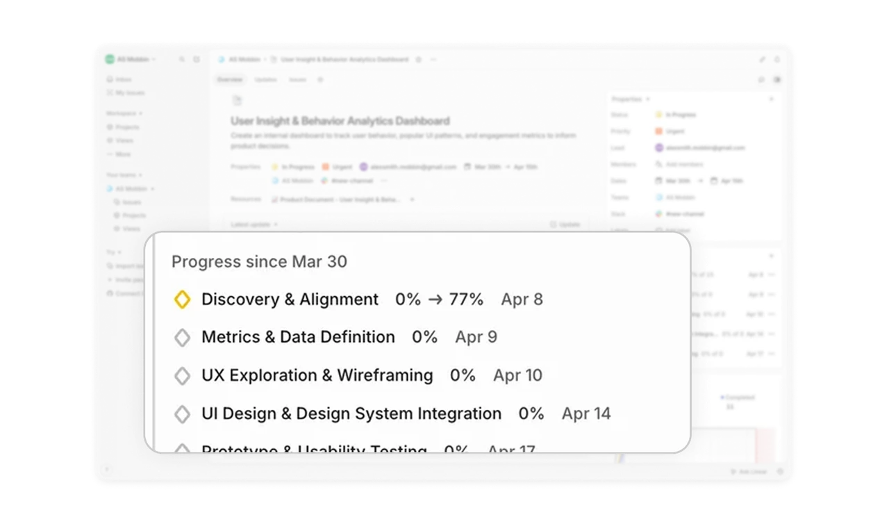
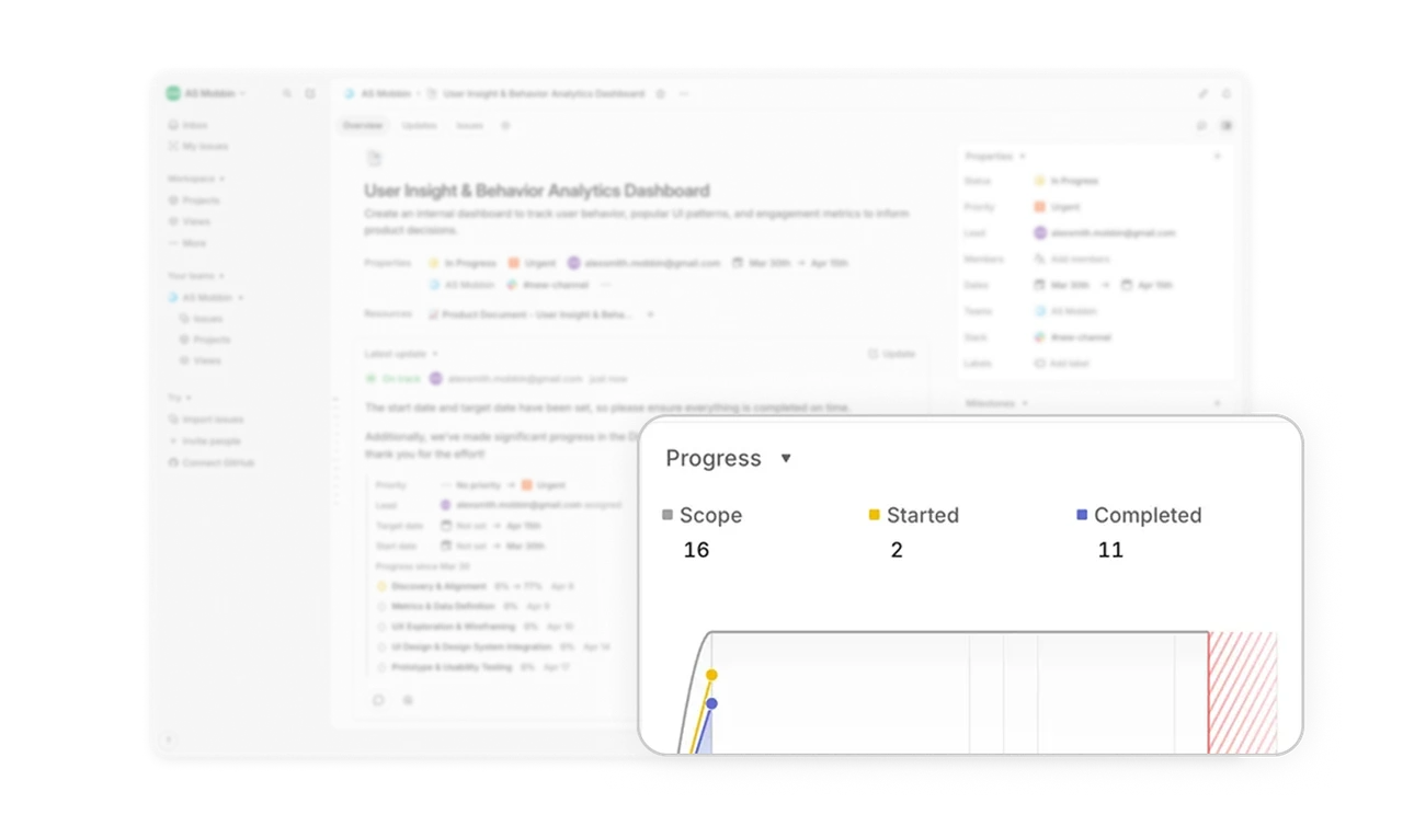
Progress as delta (0% to 77%) beats a static number
Milestones in the update show their change as before-to-after arrows, not just the current percentage. Users see velocity, not just position. Movement is more motivating than a static figure because it confirms work is happening. Any progress UI should consider showing change over time, not just where things stand right now.
Three numbers tell the project's whole story
"Scope 16, Started 2, Completed 11" sits in the bottom right as a project health snapshot. No chart, no donut, just three carefully chosen numbers. Sometimes three values beat a visualization entirely when they quantify scope, motion, and completion separately. Restraint in data display is a skill most designers undervalue.
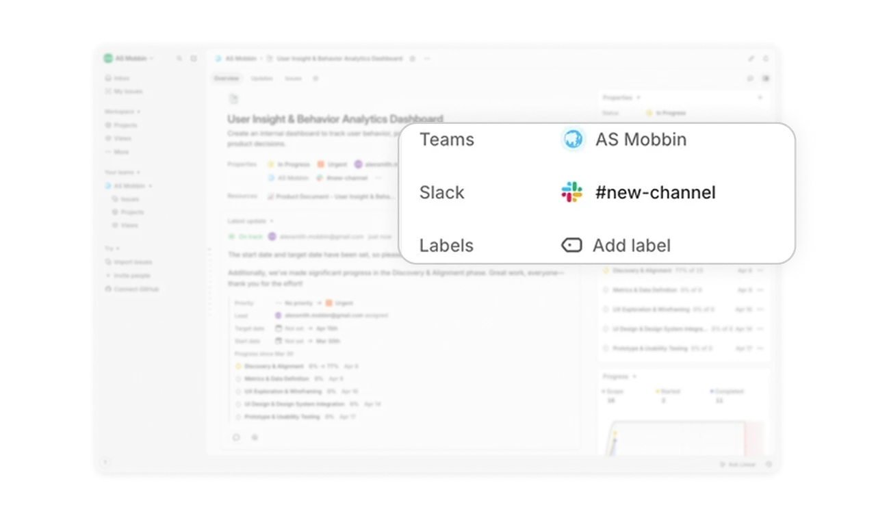
Slack channel as a first-class project property
"#new-channel" with the Slack logo sits in the properties panel alongside Status and Lead. The project's communication channel is part of the project record, not a separate tool to remember to check. Treating integrations as first-class properties rather than buried settings reduces tool-switching anxiety, which is the silent productivity killer in modern work tools.
Similar Breakdown Lessons

