Design Start Screen

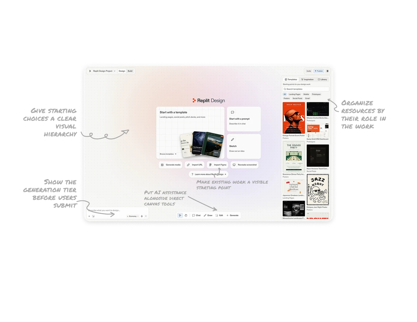
Give starting choices a clear visual hierarchy
A large template card sits beside two smaller cards for prompting and sketching, with four compact actions underneath for media generation and imports. The size differences give templates the strongest emphasis, while preview artwork makes that route tangible. When an empty state offers several ways forward, use scale and grouping to communicate priority. Keep alternatives recognizable so users can find their preferred approach without evaluating seven equally prominent choices.
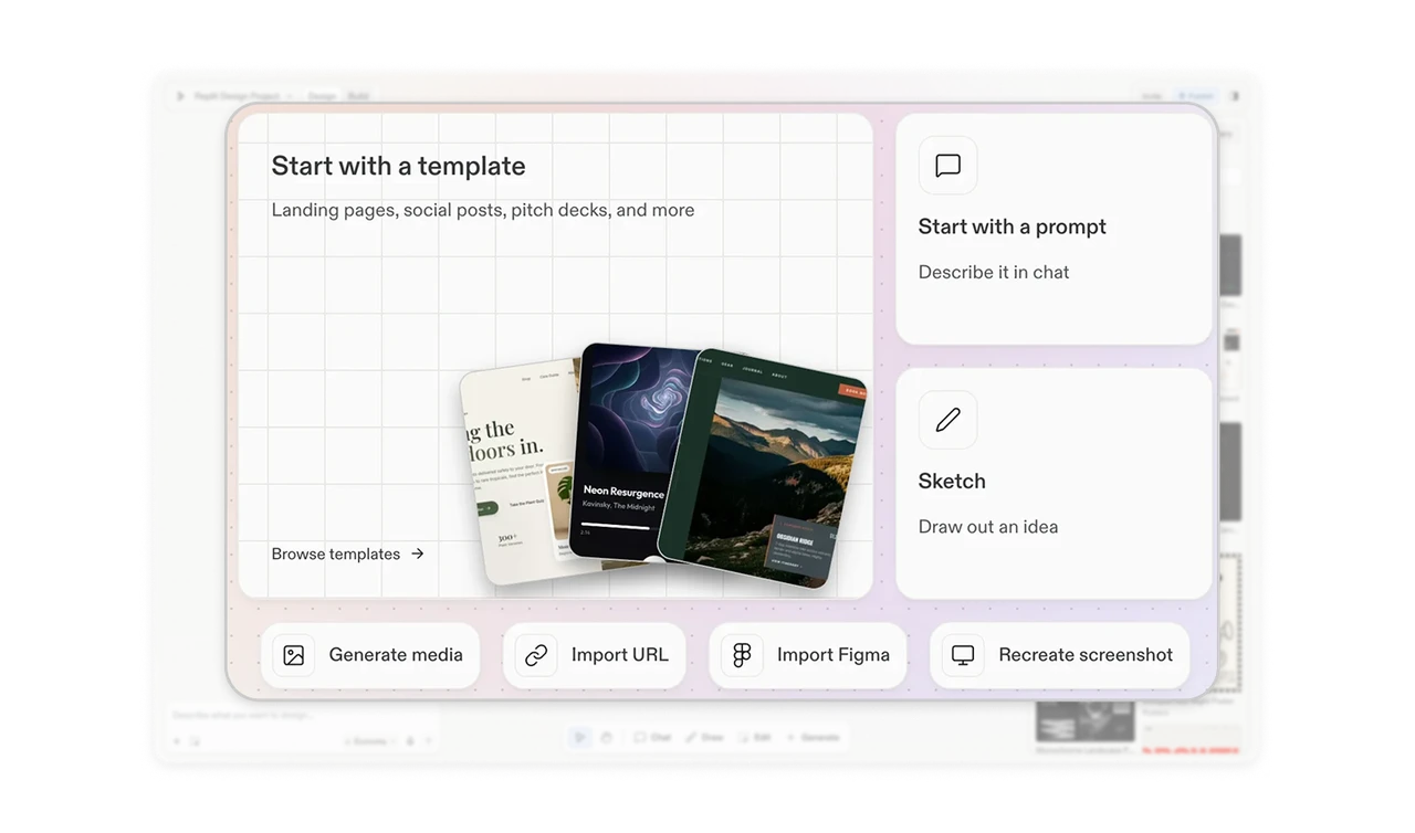
Make existing work a visible starting point
“Import URL,” “Import Figma,” and “Recreate screenshot” appear beneath the main starting cards. Each names a recognizable source users may already have, and the verbs distinguish importing from recreating. Give existing material a clear route into a creative workspace alongside templates, prompts, and sketches. Someone arriving with a website, design file, or screenshot can identify how to begin without first translating that reference into a written description.
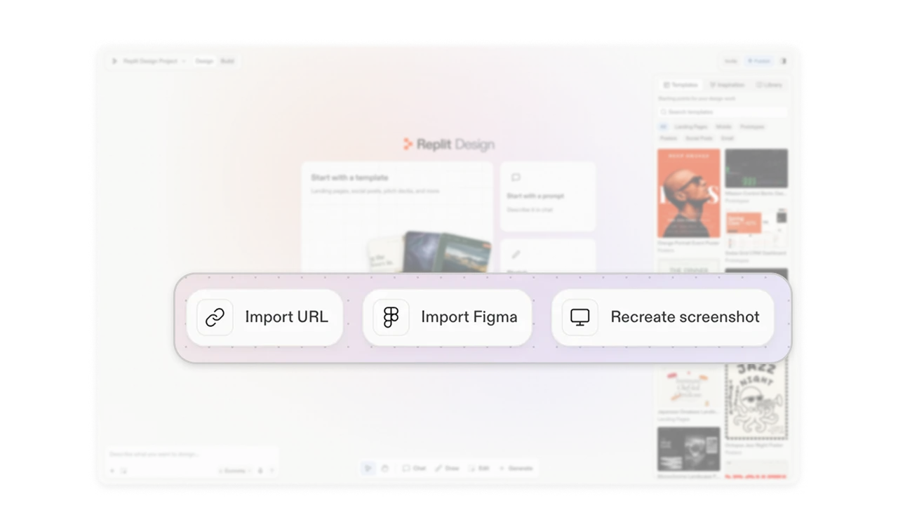
Organize resources by their role in the work
The right panel separates Templates, Inspiration, and Library into named tabs: editable starting points, static reference screenshots, and creations already made within the current project. These materials can look similar in a thumbnail while serving different purposes. Organize creative resources around how people will use them. Within Templates, repeating categories such as Posters and Prototypes beneath previews also connects each result to the filter vocabulary above.
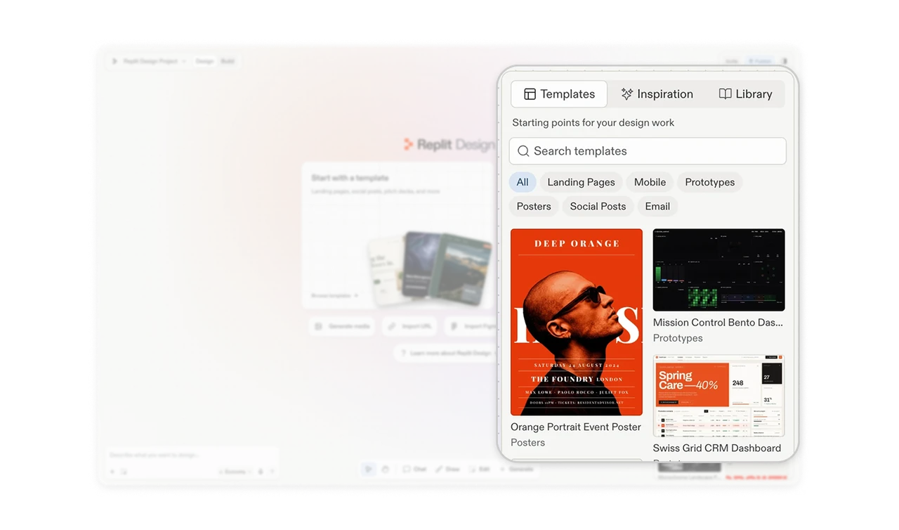
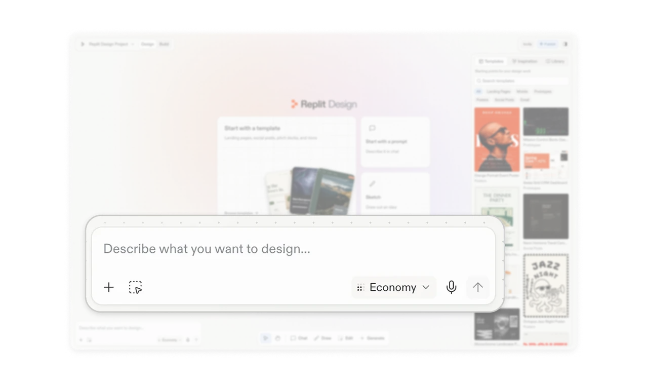
Show the generation tier before users submit
The prompt composer includes an “Economy” dropdown beside its submission controls, making the selected generation tier visible while users prepare a request. When generation offers different cost and capability tradeoffs, place that choice where the request is composed. Showing the selected tier and a way to change it lets users review the setting before submitting, without remembering a preference chosen elsewhere or identifying the underlying model by name.
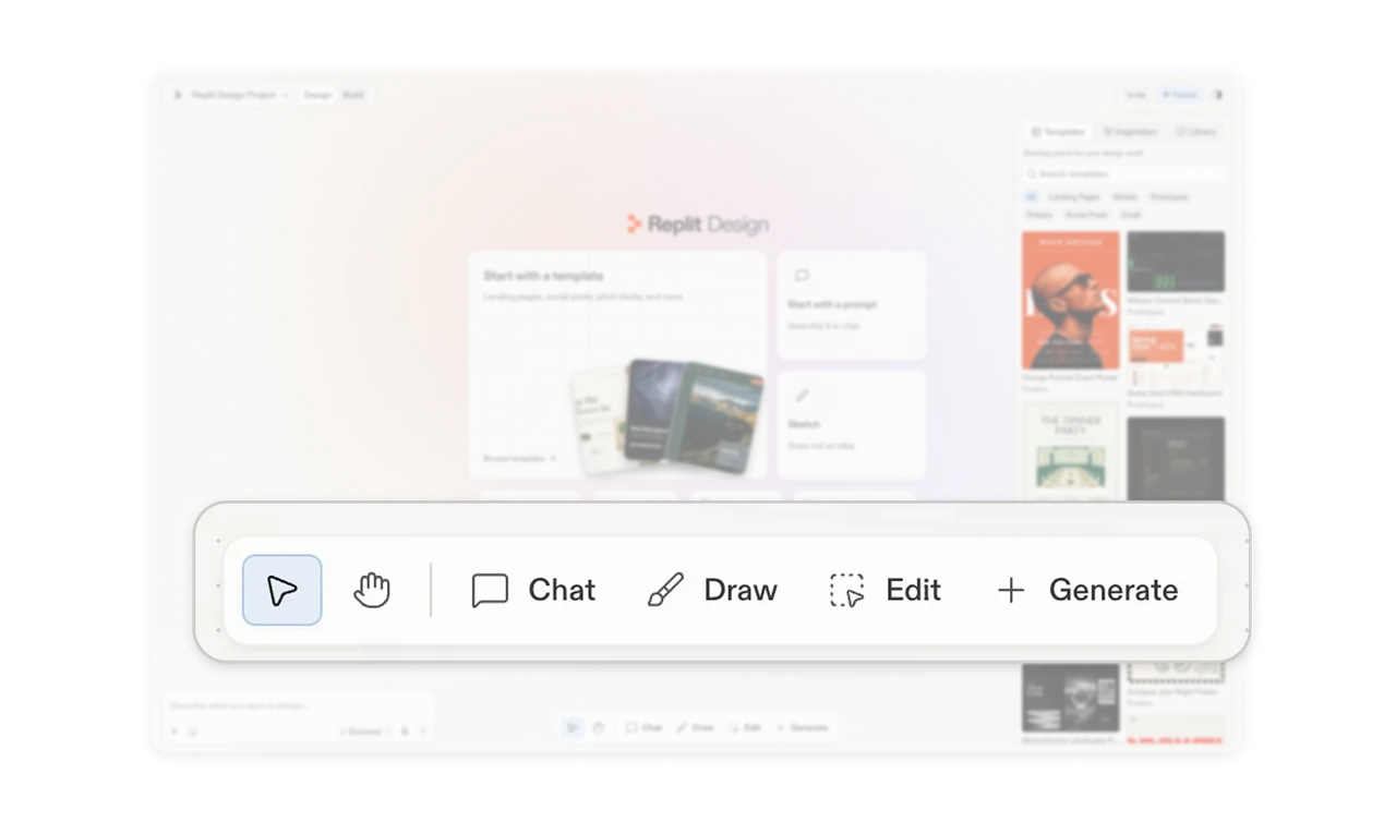
Put AI assistance alongside direct canvas tools
Chat and Generate share a floating toolbar with selection, panning, Draw, and Edit. A divider groups the navigation controls, while readable labels identify the other ways to work. This gives conversational assistance and direct visual actions a place in the same tool palette. In creative workspaces, make these methods discoverable together so users can choose how to express the next change: describe it, draw it, edit it, or generate new material.
Similar Breakdown Lessons