5 UX Lessons From InDrive's Ride Request UI - inDrive UI Breakdown
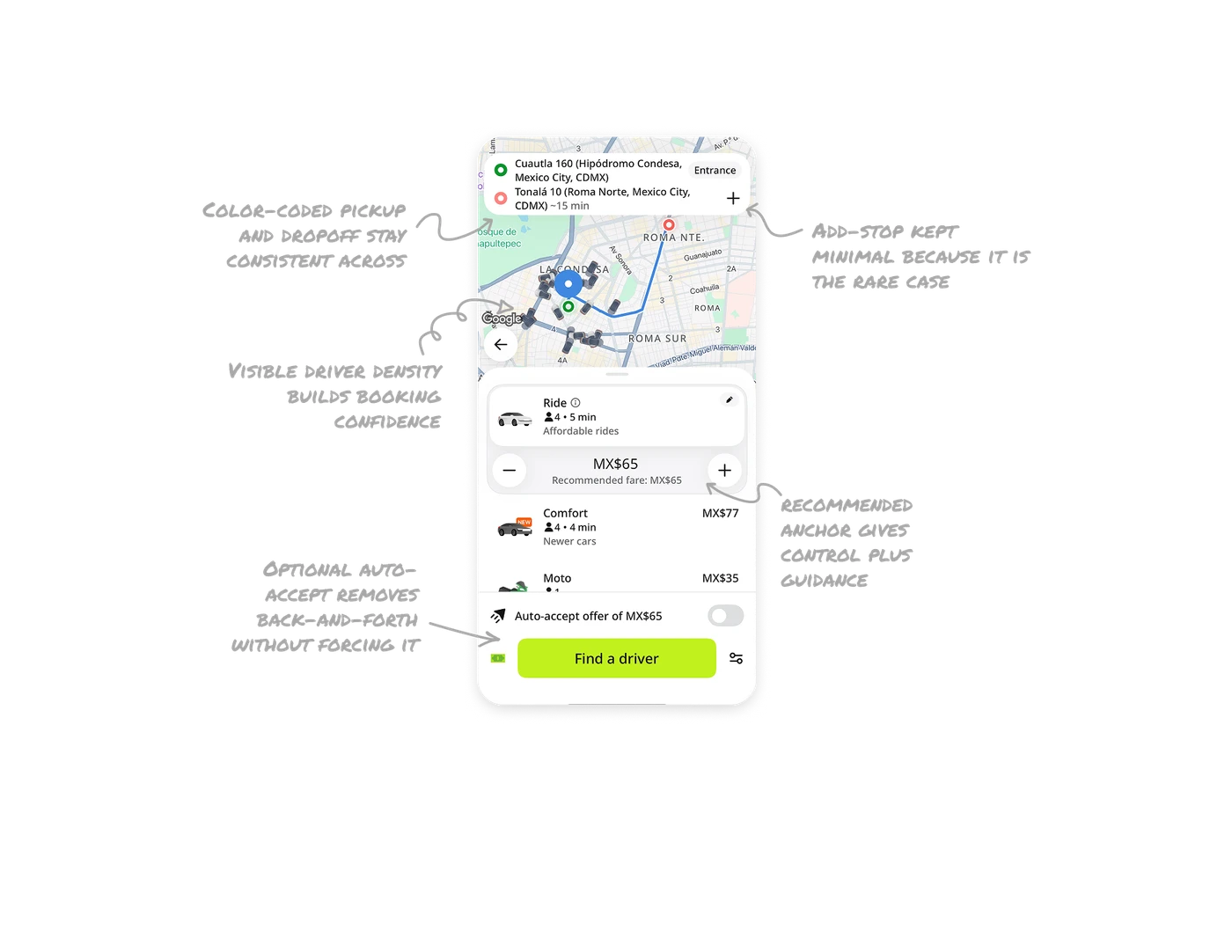
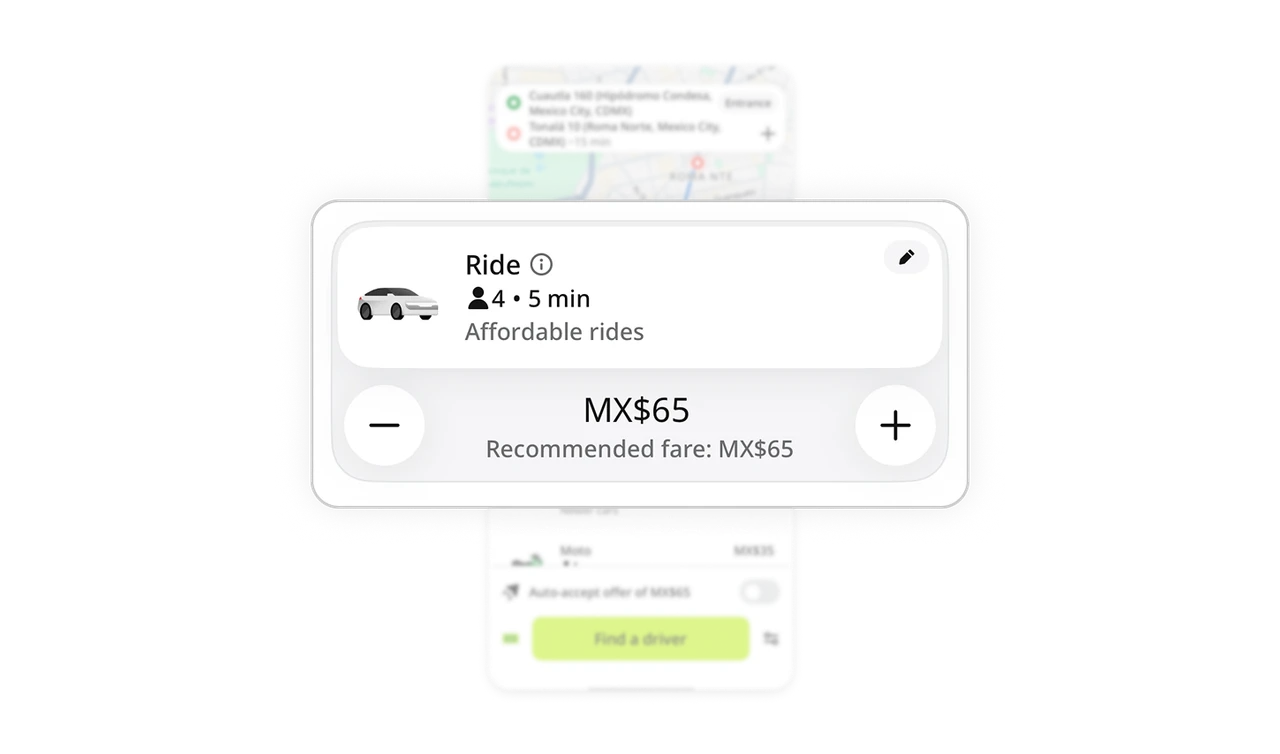
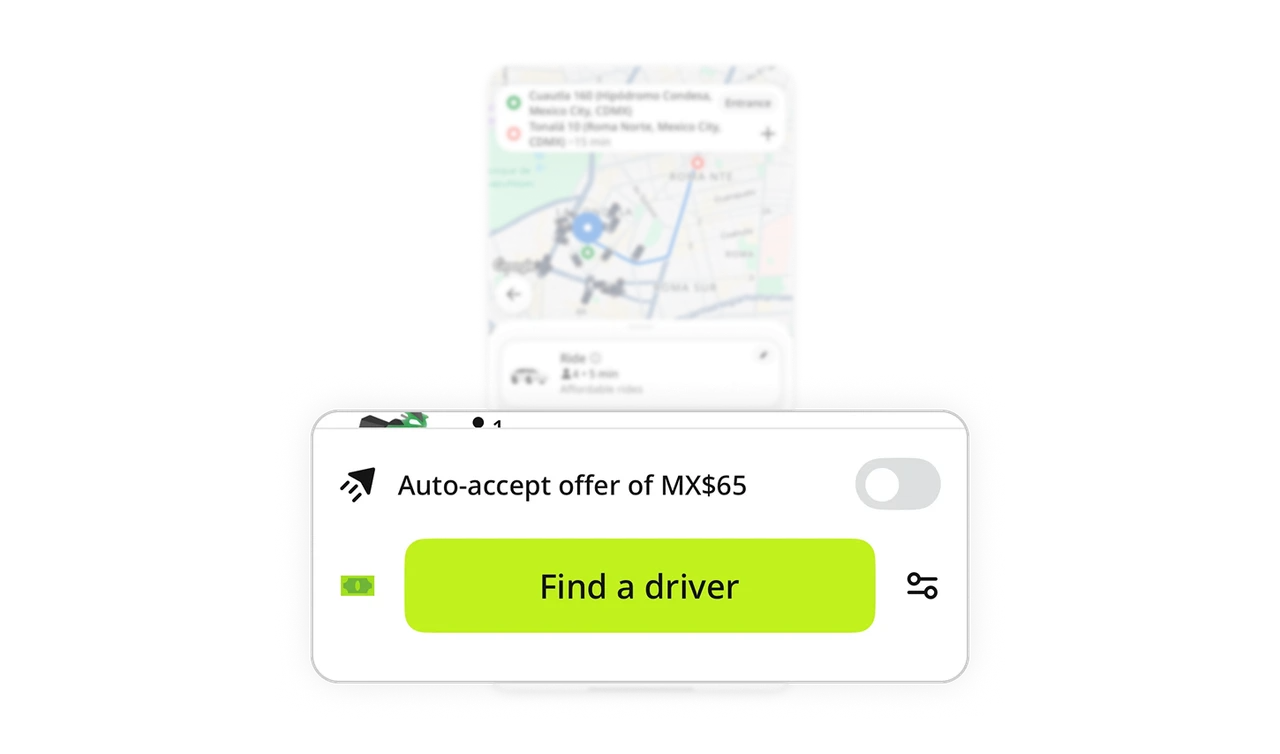
Name-your-price with a recommended anchor gives control plus guidance
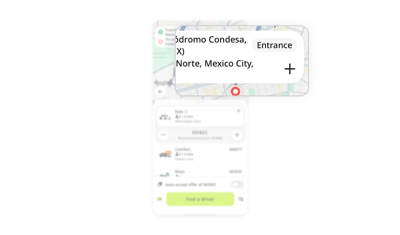
Users set their own fare with plus and minus buttons, starting from a "Recommended fare: MX$65" anchor. The anchor prevents the blank-number paralysis of a fully open field while still handing pricing power to the passenger. Giving users control over a normally fixed variable is InDrive's entire differentiation, but the recommended baseline is what makes that freedom usable instead of overwhelming.
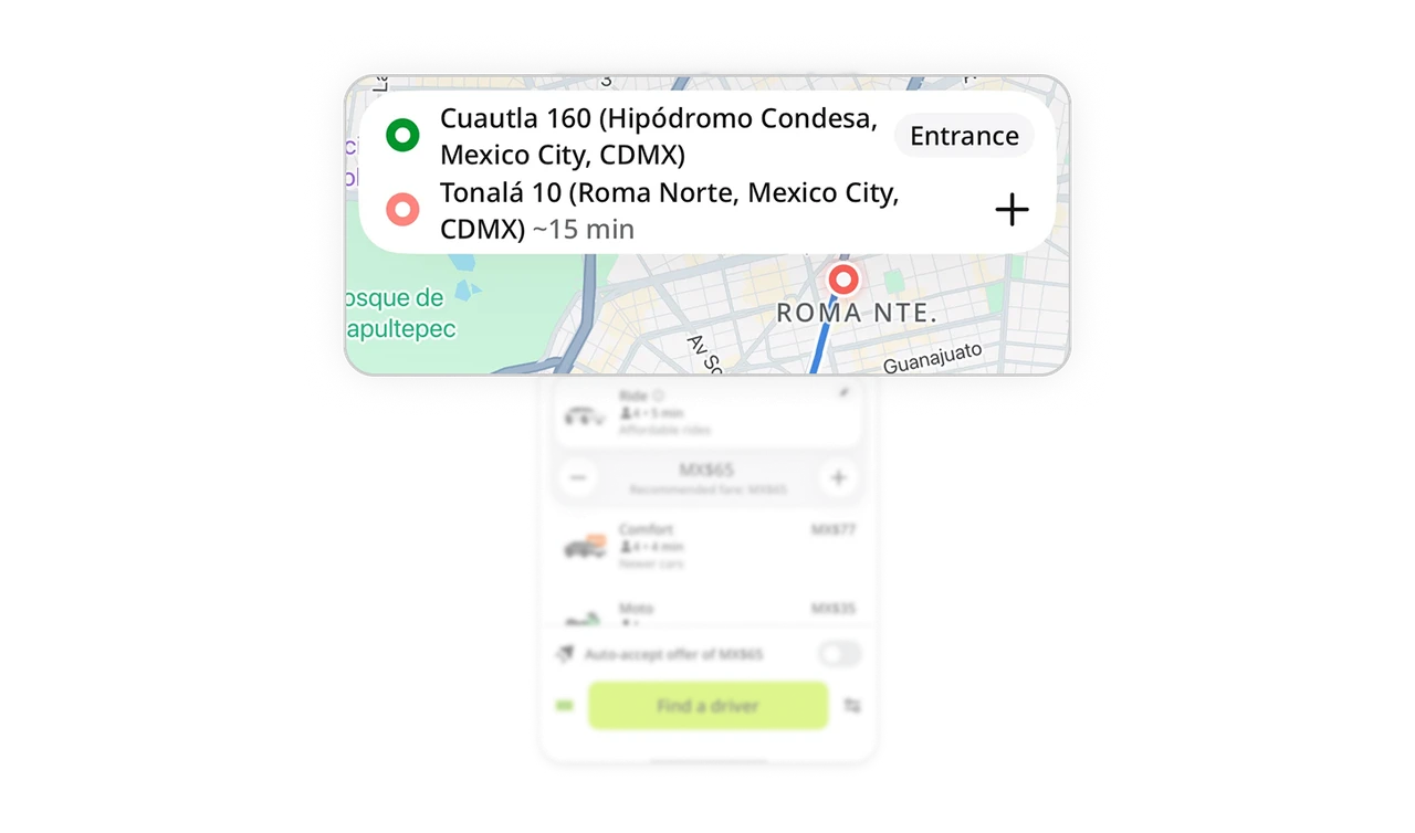
Color-coded pickup and dropoff stay consistent across map and list
Green marks pickup, red marks dropoff, in the search card and on the map route. The same color system carries through both surfaces, so users never re-learn what each point means. Consistent color encoding across views removes the mental translation cost of matching a list item to a map marker. In any product with map plus list pairing, color is the thread that ties the two together.
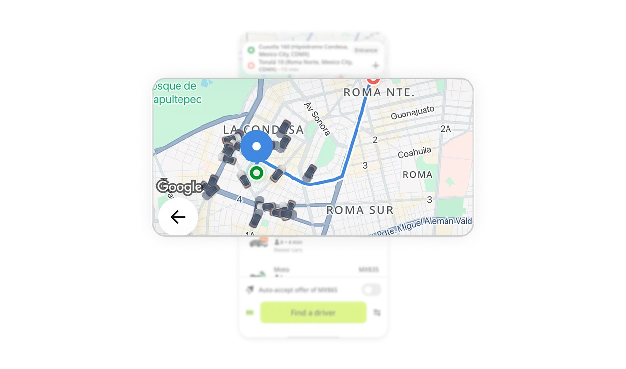
Visible driver density builds booking confidence
The map shows real car icons clustered around the pickup area. Users see how many drivers are nearby before requesting, which answers the silent question "will I actually get a ride?" Showing supply visually converts abstract availability into tangible confidence. The same number written as text would not carry the same reassurance as a map full of cars.
Optional auto-accept removes back-and-forth without forcing it
"Auto-accept offer of MX$65" sits as a toggle above the main CTA, off by default. Users who want speed flip it on and skip the negotiation loop. Users who want control leave it off. Offering automation as an opt-in rather than a default respects that different users have different tolerance for the negotiation model. The toggle adds power without imposing it.
Add-stop kept minimal because it is the rare case
The add-stop option is a small plus icon in the location card, not a prominent button. Most rides are point to point, so the uncommon multi-stop case is visually quieted to keep the common flow clean. Sizing UI elements by usage frequency, not by feature parity, is the discipline that keeps interfaces uncluttered. Rare actions should be available, but never compete with the primary path.
Similar Breakdown Lessons


