5 UX Lessons From Later's Social Content Calendar - Later UI Breakdown
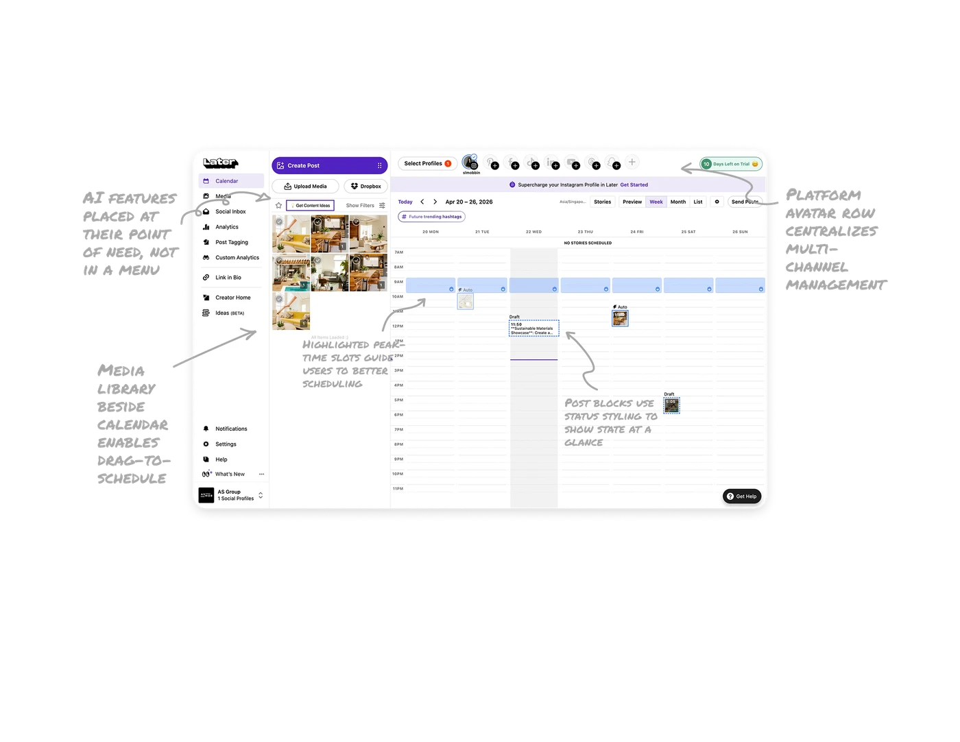
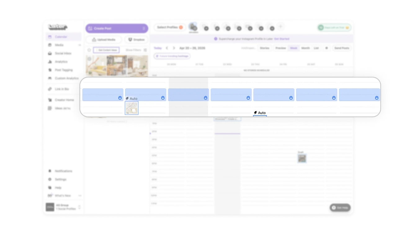
Highlighted peak-time slots guide users to better scheduling
The calendar shades the best-performing time slots with a fire icon, nudging users to schedule posts when engagement is highest. Instead of leaving timing to guesswork, the tool surfaces data-driven recommendations directly in the scheduling surface. Embedding intelligence where the decision happens beats burying it in a separate analytics tab. Users act on insight at the exact moment it matters.
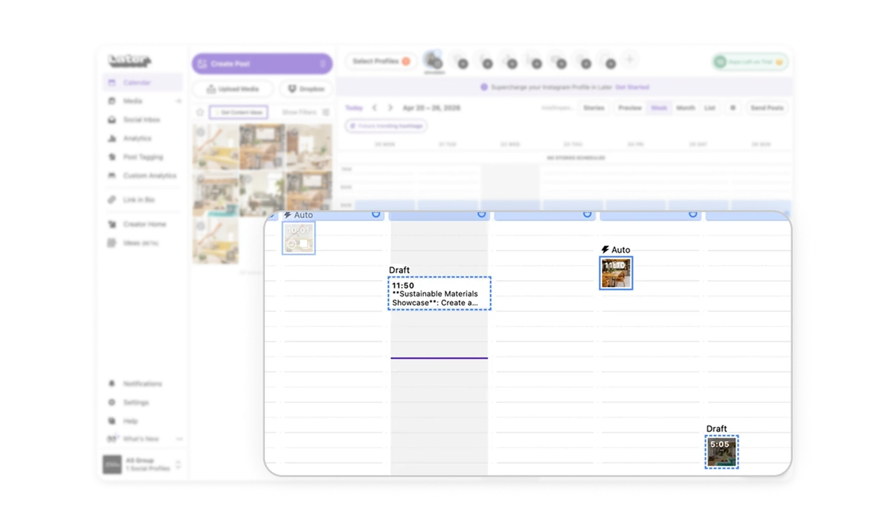
Post blocks use status styling to show state at a glance
Drafts get dashed borders, scheduled posts get solid blocks, and Auto posts carry a lightning label. Each status is visually distinct without any legend. Users scan the whole week and instantly know what is ready, what needs work, and what is automated. Encoding status into visual treatment rather than text labels lets users read the state of dozens of posts in one sweep.
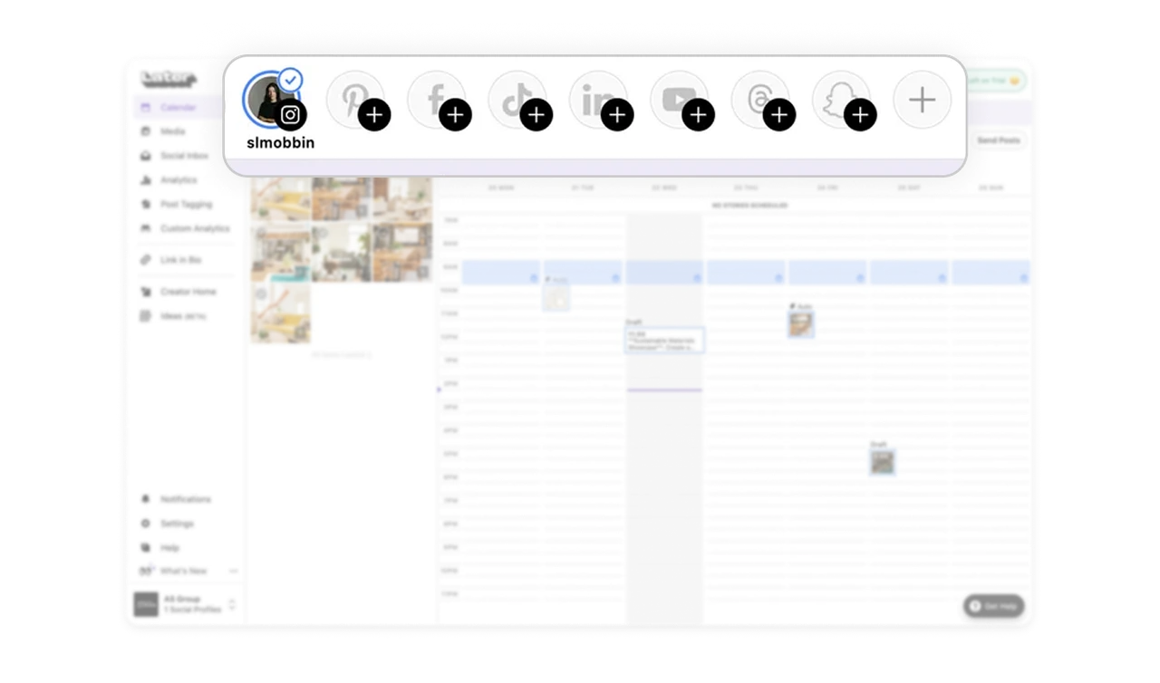
Platform avatar row centralizes multi-channel management
The top row shows connected profiles as avatars with empty-state plus buttons for platforms not yet linked. Users manage all their social channels from one calendar and switch context with one tap. The empty-state plus icons double as a growth nudge, every unconnected platform is a visible invitation to add it. Centralizing multi-channel scheduling removes the tab-switching chaos of managing each platform separately.
Media library beside calendar enables drag-to-schedule
The left panel holds the media library with selectable images while the calendar sits on the right. Users drag content directly onto time slots without uploading mid-scheduling. Keeping the source material and the destination side by side mirrors how people actually plan content: pick the visual, then place it. Spatial proximity between assets and schedule removes the back-and-forth of separate upload flows.
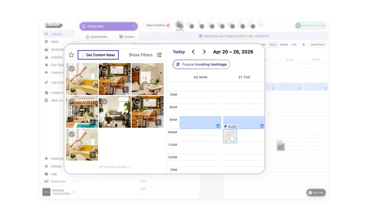
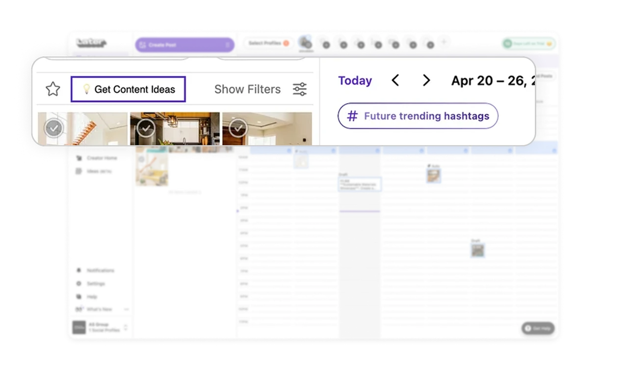
AI features placed at their point of need, not in a menu
"Get Content Ideas" sits in the media panel where users look for what to post. "Future trending hashtags" sits above the calendar where users plan reach. Each AI feature lives exactly where its job is relevant, not bundled into a generic AI tab. Niche, context-placed AI tools feel like helpful assistants rather than bolted-on features, which is what makes them actually get used.
Similar Breakdown Lessons


