Subscription Management

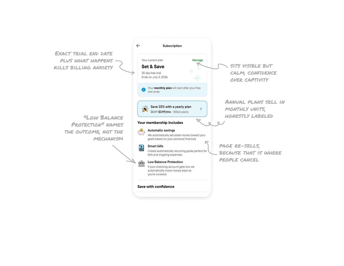
Exact trial end date plus what happens next kills billing anxiety
The plan card states "Ends on July 3, 2026," a plannable calendar date, not a vague countdown. Right below, an info banner adds "Your monthly plan will start after your free trial ends." Together they answer the two questions every trial user has: when does billing start, and what exactly happens then. Dark-pattern subscription UX hides this. Trustworthy UX leads with it, and one sentence of transparency prevents cancellation panic, support tickets, and chargebacks.
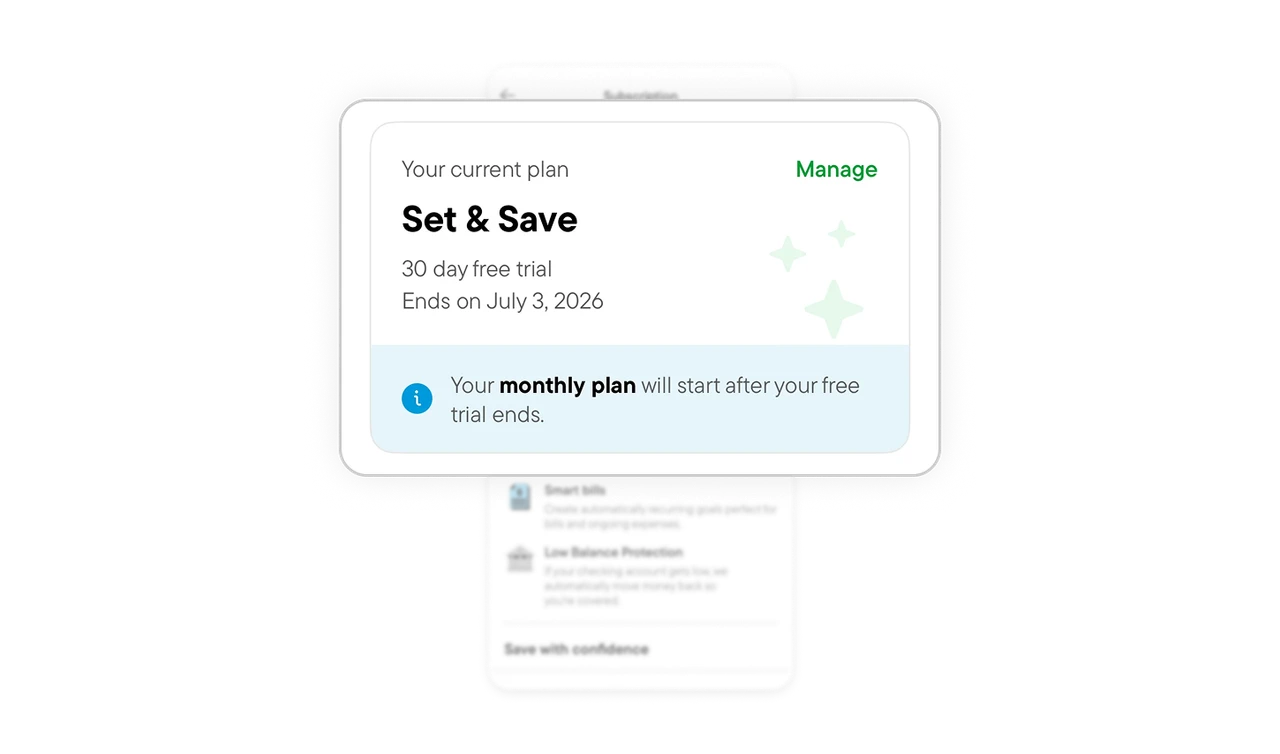
Annual plans sell in monthly units, honestly labeled
"Save 33% with a yearly plan, $5.99 struck through, $3.99/mo, billed yearly." The annual commitment is framed in the unit users already think in: per month. "$47.88/year" would trigger sticker shock, while "$3.99/mo billed yearly" is comprehensible and the cadence is stated honestly. The reframe does the convincing without deception, which is the line separating persuasion from a dark pattern.
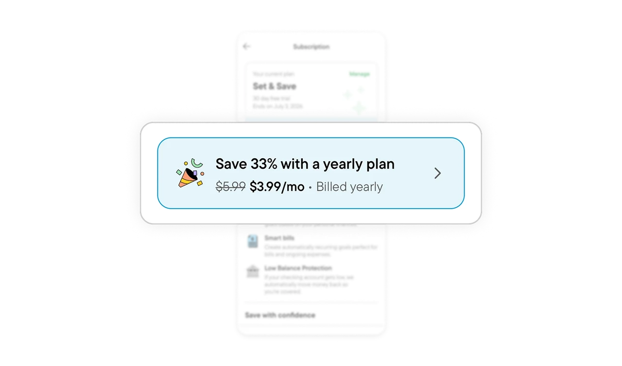
The management page re-sells, because that is where people cancel
"Your membership includes" lists three benefits with friendly illustrations and one-line explanations, shown to someone who already subscribed. Users visit this screen most often when considering cancellation, so meeting them with a warm reminder of everything they would lose is the best passive retention tool. Benefits phrased as ongoing actions ("we automatically set aside money") emphasize the service is working for them right now, not just a feature list they bought once.
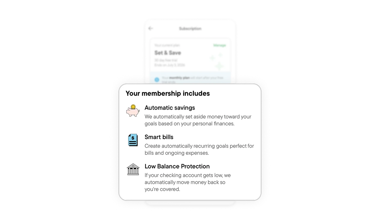
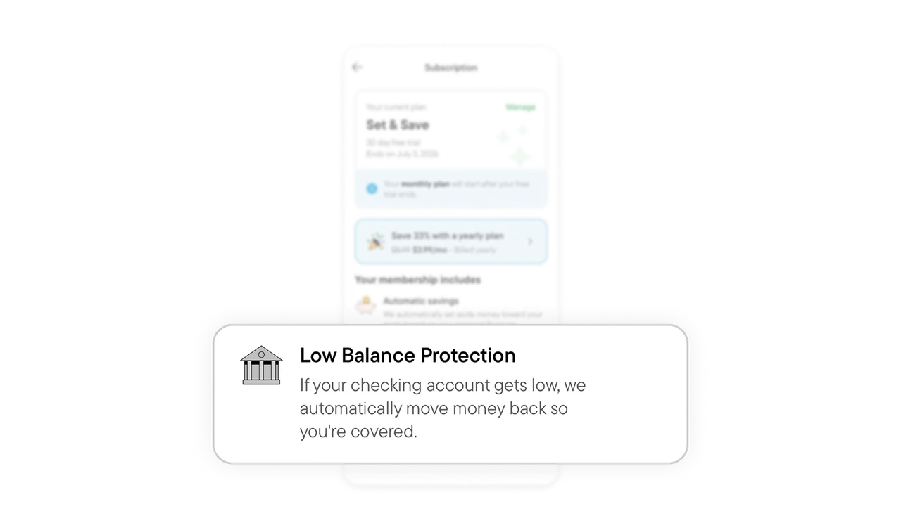
"Low Balance Protection" names the outcome, not the mechanism
The benefits are named after what they deliver: Automatic savings, Smart bills, Low Balance Protection. The last one answers "what does this do for me?" in the name itself, then explains the promise: if your checking gets low, money moves back automatically so you are covered. Naming features after the human situation they protect beats naming the technical function, users buy outcomes and only tolerate mechanisms.
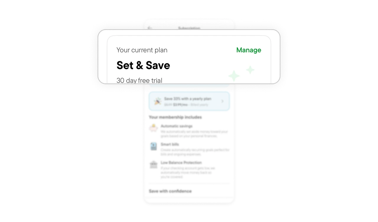
"Manage" sits visible but calm, confidence over captivity
A quiet Manage link sits in the plan card's top corner. Plan changes and cancellation are one tap away, no maze, no support-chat gatekeeping, yet the link is not so loud it invites churn. Hiding cancellation destroys trust and now violates regulations in many markets. Making it visible but calm respects the user while keeping the page's emphasis on value. Confidence retains subscribers, captivity just delays their exit and poisons the review they leave on the way out.
Similar Breakdown Lessons