Freelancer Search

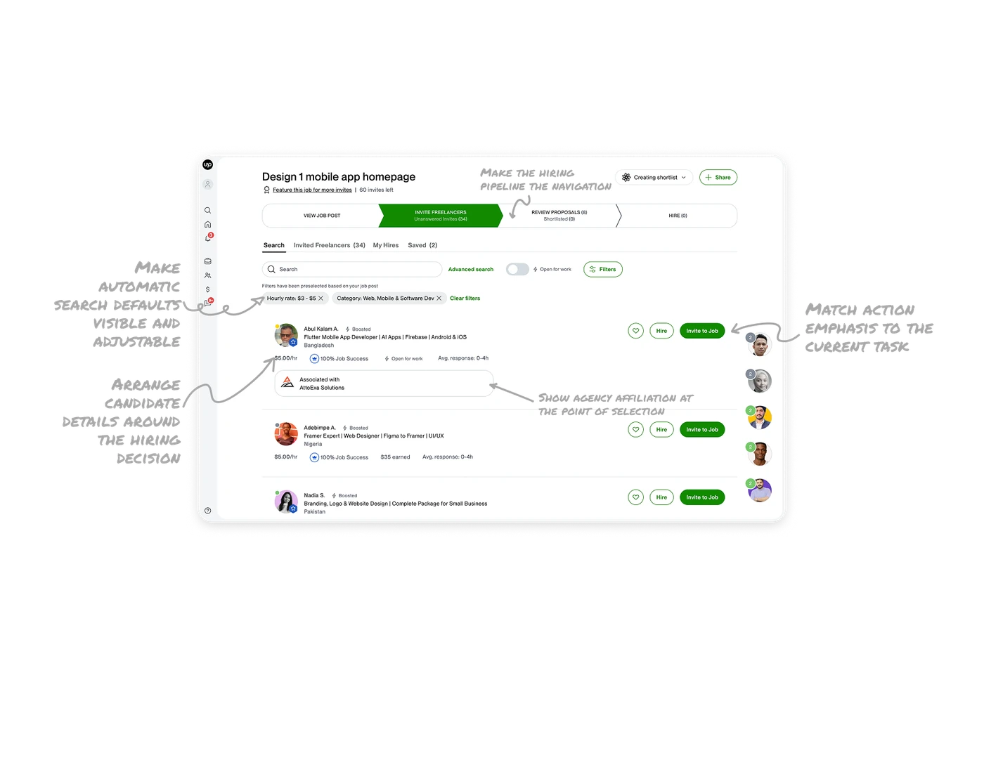
Make automatic search defaults visible and adjustable
The search area explains that filters were preselected from the job post, then displays hourly-rate and category selections as chips. Each chip has a removal control, and “Clear filters” removes the set. This makes the system’s starting assumptions visible and adjustable. When reusing information from an earlier step, show what it changed in the current view and let users revise those choices where they inspect the results.
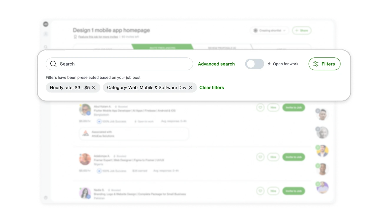
Make the hiring pipeline the navigation
Four chevron segments map the hiring process from viewing the job post through invitations, proposal review, and hiring. The active stage is filled green, while counts show unanswered invitations, proposals, shortlisted candidates, and hires. The navigation therefore carries an overview of the work itself. When a task moves through stages, combine the route through the workflow with counts showing what each stage contains so users can decide where to focus before opening another section.
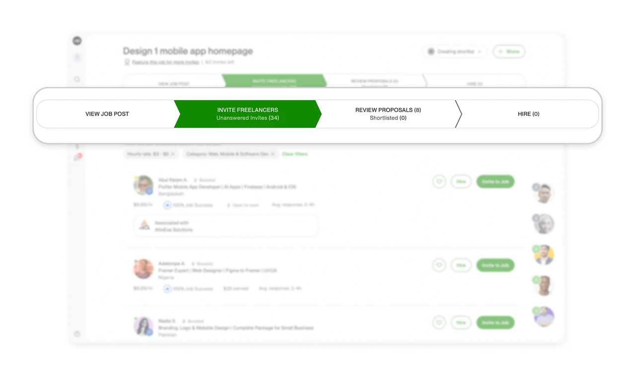
Arrange candidate details around the hiring decision
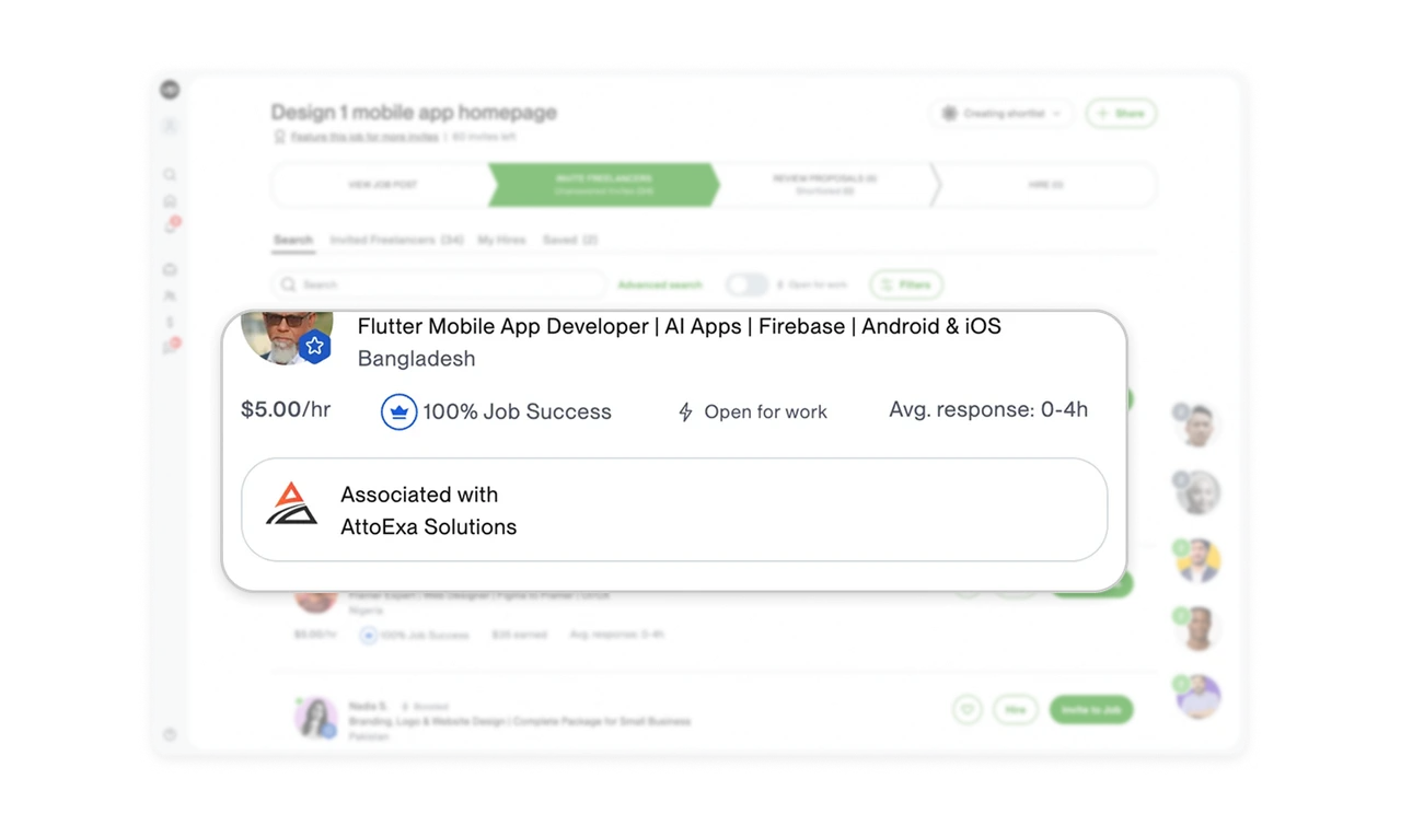
The first freelancer’s stat line moves from hourly rate to Job Success, advertised availability, and average response time. Another result includes “$35 earned,” adding earnings context alongside its success score. Together, these details bring cost, track record, and responsiveness into the initial comparison. Arrange listing information around the questions that inform selection, using clear labels and a repeatable structure so users can assess relevant evidence before opening each profile.
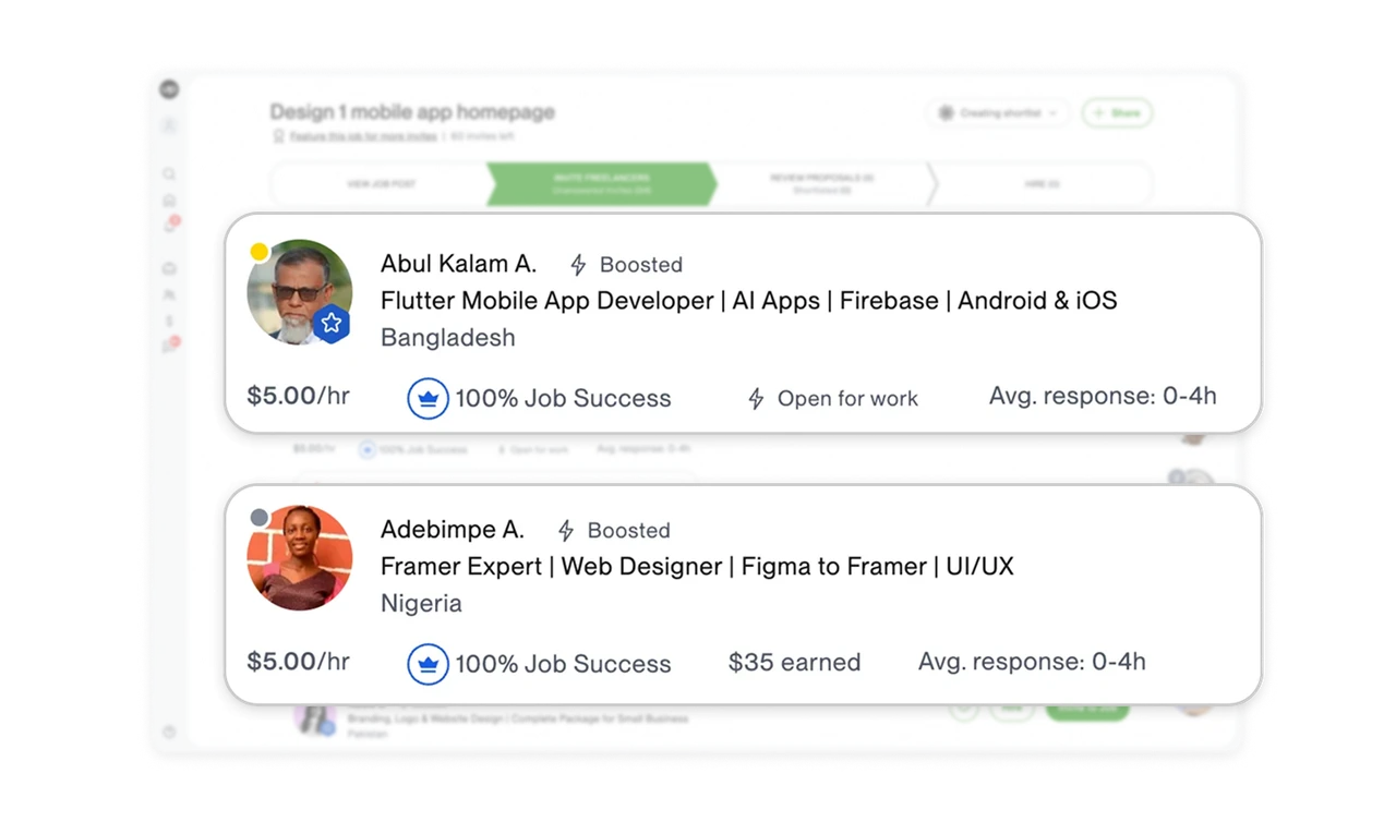
Match action emphasis to the current task
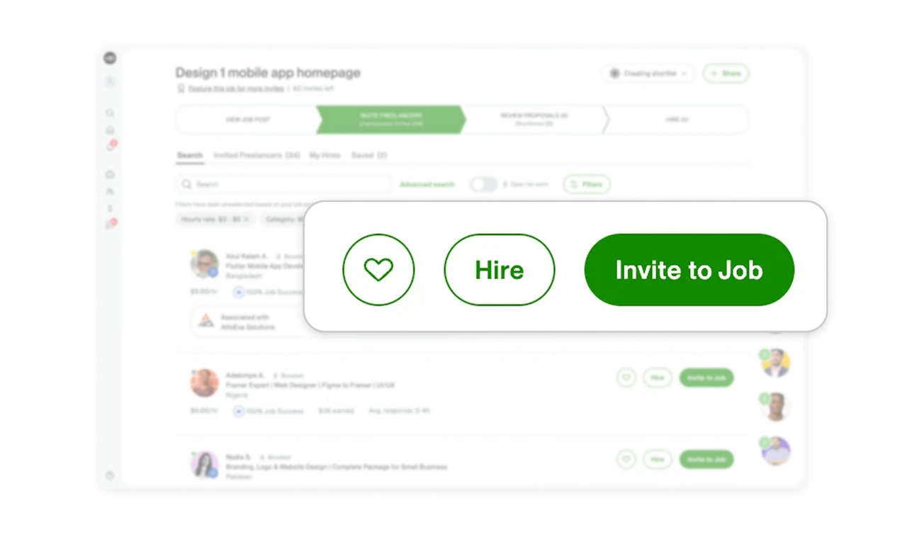
Each freelancer row gives “Invite to Job” a filled green button, while “Hire” and the heart icon use outlines. The strongest treatment matches the active invitation stage, with other options available beside the same candidate. When several actions belong to one result, make the action most relevant to the current task visually dominant. Consistent placement and contrasting treatments help users locate that action while retaining access to alternatives.
Show agency affiliation at the point of selection
A bordered “Associated with” panel beneath the first freelancer names AttoExa Solutions and displays its logo. The separate container distinguishes this organizational relationship from the individual’s skills and performance metrics. Clients can notice the affiliation and investigate its implications before proceeding. When a profile connects a person to a wider organization, make that relationship explicit within the selection view so users can consider both the individual and their organizational context.
Similar Breakdown Lessons