Group Food Order

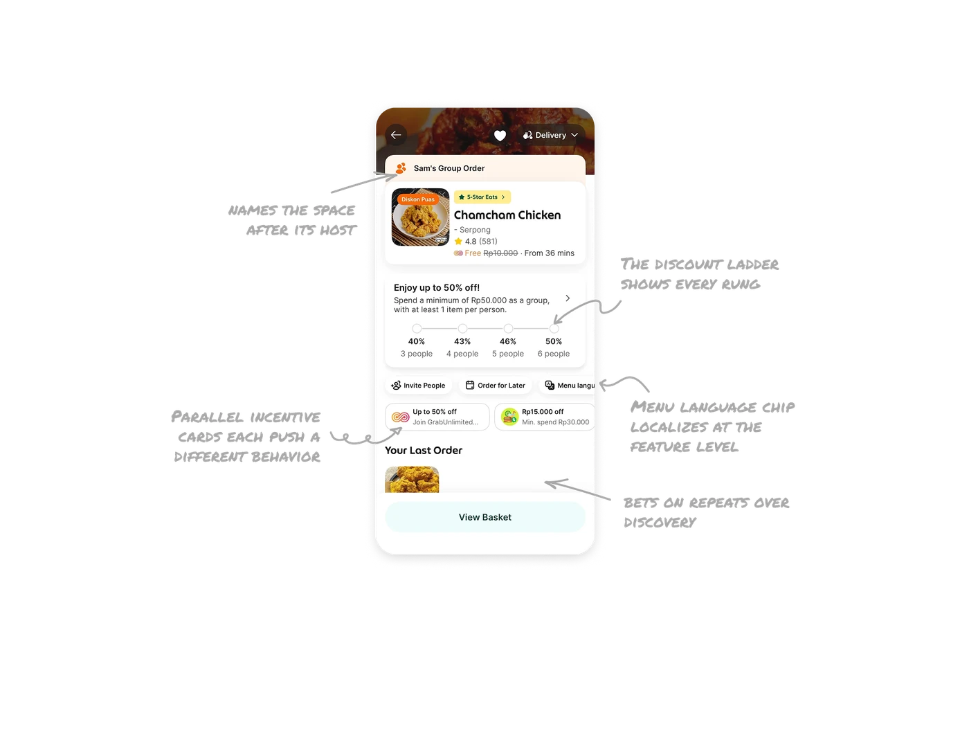
The discount ladder shows every rung, not just yours
A progress track maps headcount to savings: 40% at 3 people, 43% at 4, 46% at 5, 50% at 6. The full ladder is visible as stations on a line, so "invite one more friend" is worth a concrete, visible percentage for everyone. When rewards scale with participation, show the whole ladder. The visible next rung turns each existing member into a recruiter, while a hidden formula motivates no one.
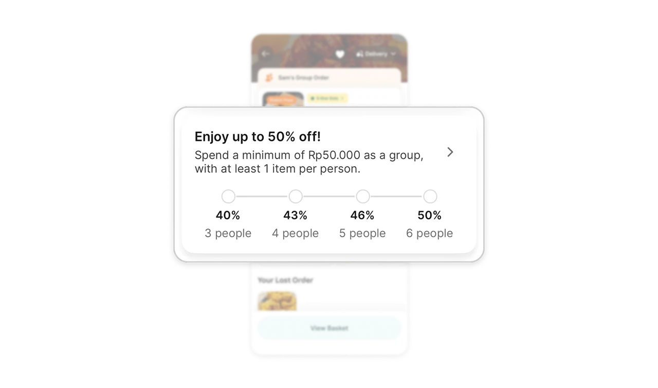
"Sam's Group Order" names the space after its host
The peach banner names the order after the person who started it, not "Group Order #4821." Everyone joining knows whose party this is. Ownership framing creates social accountability: the host feels responsible for driving the order to completion, and joiners feel invited by a person rather than a system. Naming shared spaces after their human host is the cheapest social-glue mechanic a collaborative feature can ship.
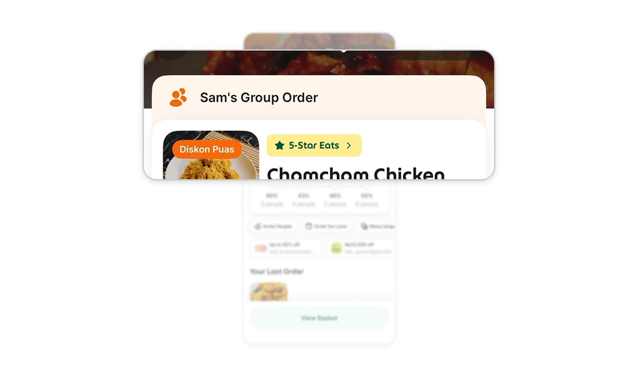
Menu language chip localizes at the feature level
The chip row surfaces group-mode utilities: Invite People, Order for Later, and Menu language, a translation toggle as a first-class action. In Grab's multilingual Southeast Asian market, one group's members may not share a reading language, and the product plans for it. Localize at the feature level, not just the app level. Deep localization is invisible until you see a product genuinely built for its market instead of translated into it.
Parallel incentive cards each push a different behavior
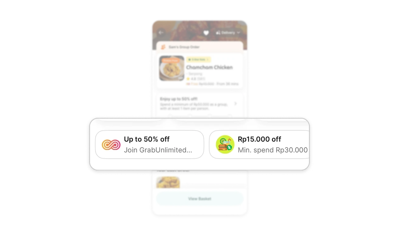
Two offer cards sit side by side: "Up to 50% off, Join GrabUnlimited" (subscription) and "Rp15.000 off, Min. spend Rp30.000" (threshold voucher), on top of the group ladder above. Three savings paths, each stating its own rule, each pushing a different behavior: loyalty, basket size, virality. Layered incentives work when presented as equal cards with transparent rules, because users pick their route instead of feeling played by overlapping fine print.
"Your Last Order" bets on repeats over discovery
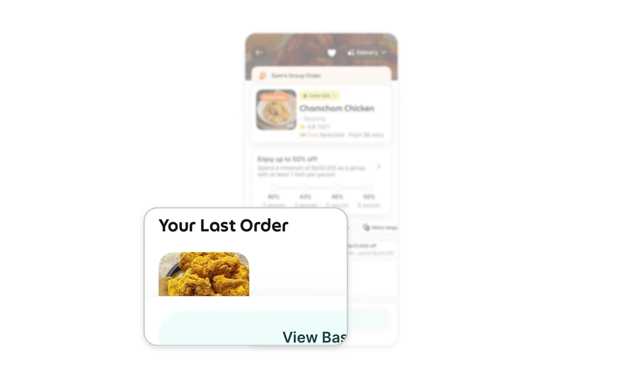
The previous order surfaces with its photo, one tap from repeating a known-good choice. Most food-delivery sessions are repeats, not explorations, and the layout admits it. In high-frequency categories, reordering beats discovery, so the shortest path to the most likely action belongs on the main screen. Products that force discovery on habitual users add friction to their most loyal segment, the one that least deserves it.
Similar Breakdown Lessons